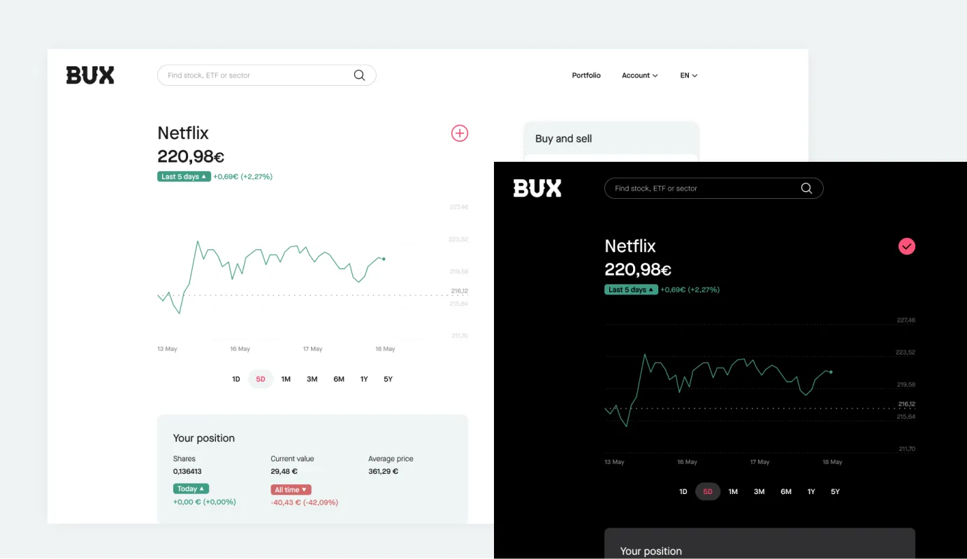
The Strategic Challenge: Expanding Beyond Mobile
By 2021, BUX’s mobile app had achieved remarkable success with 1M+ users across Europe. But our data revealed a critical opportunity: users wanted advanced features that were better suited for larger screens—detailed portfolio analysis, complex charting, and educational content.
As Product Manager, I was tasked with bringing BUX to the web while maintaining our mobile-first DNA and user experience excellence.

The Product Strategy: Complementary, Not Duplicate
The Insight: Web wasn’t just a bigger mobile app. Desktop users have different behaviors, needs, and interaction patterns.
My Approach:
- Mobile: Optimized for quick trading, notifications, and on-the-go portfolio checks
- Web: Focused on analysis, research, and educational content consumption
- Seamless Integration: Real-time sync between platforms with consistent data and user state
Design Innovation: Rethinking Information Architecture
The Challenge: Mobile apps use sequential navigation (swipe, tap, navigate). Desktop users expect simultaneous information access.
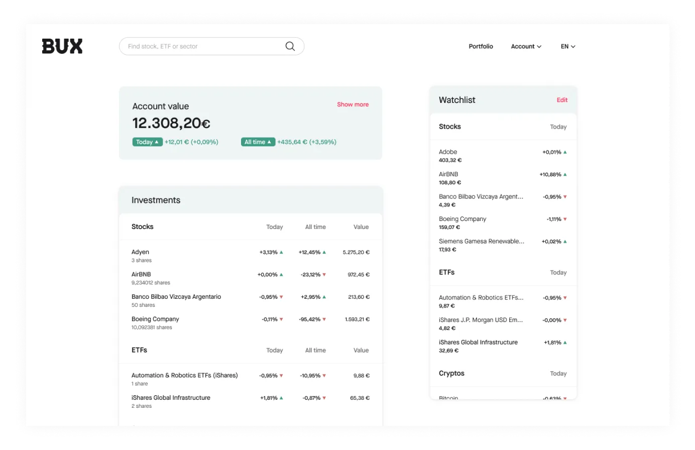
My Solution: Developed a unified dashboard that combined multiple mobile screens into one comprehensive view:
- Live portfolio performance
- Real-time watchlist updates
- Integrated news feed
- Advanced charting tools
- All visible simultaneously without context switching

Building the Right Team
The Leadership Challenge: We needed to build an entirely new engineering team specialized in web technologies while maintaining our mobile-first culture.
My Approach:
- Hired for Complementary Skills: Found web engineers who understood mobile constraints
- Cross-Platform Collaboration: Established shared design systems and API standards
- User-Centered Focus: Ensured both teams prioritized user experience over technical preferences
The Results: Expanding Market Reach
User Growth:
- 40% increase in user engagement across platforms
- 25% of new users now start on web before adopting mobile
- 60% of power users regularly use both platforms
Product Impact:
- Advanced users stay 3x longer on platform
- Educational content consumption increased 200%
- Professional traders began choosing BUX over traditional platforms
Technical Leadership: Bridging Mobile and Web
API Strategy: Led the development of unified APIs that served both mobile and web, reducing development complexity and ensuring feature parity.
Performance Optimization: Applied mobile-first performance principles to web, achieving faster load times than traditional desktop trading platforms.
Responsive Design: Ensured the web platform worked seamlessly across desktop, tablet, and even mobile browsers.
Why This Experience Matters
Multi-Platform Product Strategy: Demonstrated ability to expand successful products across platforms while maintaining brand consistency and user experience.
Technical Leadership: Managed engineering teams across different technology stacks, ensuring architectural coherence and shared standards.
User-Centered Design: Applied deep user research to make platform-specific design decisions rather than following industry conventions.
Growth Focus: Translated product expansion into measurable business outcomes and user growth.
Team Building: Successfully hired and integrated new engineering talent while maintaining company culture and product quality.
Looking for a product leader who can take your successful product to new platforms and markets? Let’s discuss how I can help you scale your next big idea.
